ARTICLES
Using Flexdashboards to Monitor Clinical Research
Much of my work involves prospective clinical research, where data collection can take months or years to complete and relies on continuous effort from multidisciplinary teams. Throughout the study, we monitor progress in various ways, such as…
- Rates of enrollment and reasons for patient exclusion, to make sure our study pace is on target and the cohort reflects the population we intended to study
- Open-label medication use, to make sure we can draw reliable conclusions about the actual difference between our treatments
- Key aspects of the study protocol, such as making sure study devices are worn consistently
- Follow-up rates, to alert us when we need new strategies to maintain contact with patients and their families over years of follow-up
In previous studies, our critical care research organization used weekly PDF reports created in knitr/LaTeX to monitor study progress. While helpful, their length and detail tend to bury our most important metrics amid numbers that we only need occasionally. For our most recent study, I created a flexdashboard which summarizes our most important metrics of study progress in a way that
- Gives us a quick, clear overview of what’s happening;
- Provides additional detail as needed via interactive graphics; and
- Updates on every run by accessing our database API.
The entire project can be found in this Github repo; it includes an .Rmd file for the actual dashboard which sources a .R script for data preparation.
Study Background
The MOSAIC (Measuring OutcomeS of Activity in Intensive Care) study will evaluate the relationship between patients’ activity levels during their ICU stay and their disability, physical function, and cognition up to a year after their critical illness. More information on the study can be found on clinicaltrials.gov.
We started data collection in March 2017, and will eventually enroll 312 patients from the Vanderbilt ICUs. As patient enrollment and follow-up continue, we want to monitor rates of screening, enrollment, and follow-up and to make sure that key study data is being collected while patients are in the hospital. Enter the flexdashboard!
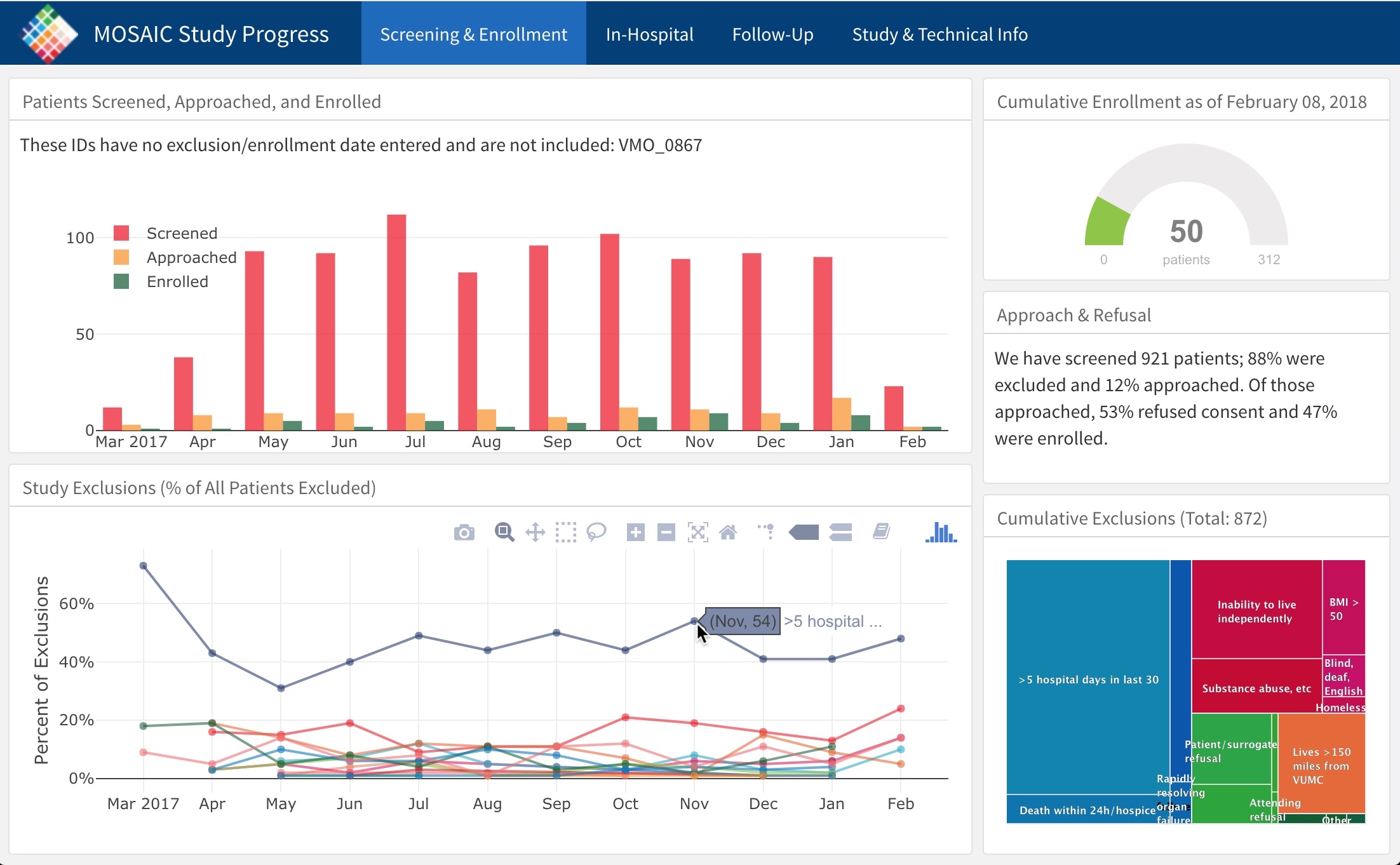
Screencap of MOSAIC dashboard
Out of an abundance of caution for sharing patient information, I’m not sharing the actual dashboard here.
Update January 2019: The actual dashboard for this study can be seen here! I also used a similar approach for a later study (source code). Thanks to PIs Brummel and Patel for allowing me to share these!
Flexdashboard Primer for the Unfamiliar
RMarkdown, saved with the .Rmd extension, allows us to interweave R code with Markdown text and create output in HTML, PDF, and other formats. flexdashboards are a specific type of HTML output which emphasizes data visualizations. Use your .Rmd YAML to specify this output type and set a few options:
---
title: "MOSAIC Study Progress"
output:
  flexdashboard::flex_dashboard:
    orientation: columns
    vertical_layout: fill
    theme: cosmo
    logo: favicon_48x48.png
    favicon: favicon_48x48.png
---
If you use RStudio, flexdashboards are also available as an RMarkdown template when you create a new file. RStudio’s flexdashboard page has more!
Flexdashboards can include interactive components using Shiny. That level of interactivity wouldn’t add much value for our single-center study, and I wanted to be able to send a static file to our team (vs requiring an internet connection), so we stick to the simpler non-Shiny version. For multicenter studies, I think using Shiny or trelliscopejs have a lot of potential for looking at overall numbers as well as individual site metrics.
Particularly Helpful Features
Rather than repeat how-to information you can find in the very helpful flexdashboard docs, I’ll highlight some features and capabilities I’ve found particularly useful in the context of clinical research monitoring.
Separate Pages for Separate Topics
Most of our studies are divided into three phases, each conducted by different teams within our group. Having one flexdashboard page per phase helps each team quickly focus attention on the most relevant metrics for their work. It’s easy to do using Markdown headers:
Screening & Enrollment
=====================================

In-Hospital
=====================================

Follow-Up
=====================================

Study & Technical Info
=====================================
Interactive Graphics
There are quite a few ways to incorporate interactive graphics into a flexdashboard (see htmlwidgets for one great list of options); thus far, I’ve mainly used plotly, which has allowed us to focus on the big picture quickly while incorporating detailed information in tooltips. For example, we have 17 separate reasons for study exclusion, and want to track how these change over time. Using text or legends to denote which line is which exclusion would take up valuable screen real estate; by including that information in tooltips instead, we can access that information only when we need it. plotly’s zoom capabilities are also really helpful for investigating data points more closely.
Hierarchical Treemaps with the treemap and highcharter Packages
Treemaps are another useful way for us to quickly get an overview of some piece of study information, then drill down for more detail as needed. For example, we’ve grouped our 17 exclusions into a few major categories. A quick look at our treemap gives us a great broad sense of why patients are being excluded. If we’re curious about what specific medical reasons are excluding patients, for example, we can drill down and see those details.
Code for treemap
## -- Shortened, simulated example of our exclusions treemap -------------------
library(treemap)
library(highcharter)
## Highcharts (www.highcharts.com) is a Highsoft software product which is## not free for commercial and Governmental useexc_df <- data.frame(
Reason = c(
">5 hospital days in last 30", "Cannot complete verbal assessments",
"BMI > 50", "Moribund", "Homeless", "Inability to live independently",
"Lives >150 miles away", "No surrogate within 72h", "Other",
"Refused consent", "Rapidly resolving organ failure",
"Severe neurologic injury", "Study with no co-enrollment",
"Substance abuse"
),
n_reason = c(482, 21, 53, 43, 8, 125, 75, 40, 3, 62, 8, 51, 5, 69),
n_patients_exc = rep(1000, 14),
reason_type = c(
"Medical exclusions", "Patient characteristics",
"Patient characteristics", "Medical exclusions",
"Patient characteristics", "Patient characteristics", "Geography",
"Informed consent", "Other exclusions", "Informed consent",
"Medical exclusions", "Medical exclusions", "Other exclusions",
"Patient characteristics"
)
)tm_exc <- treemap(
dtf = exc_df,
index = c("reason_type", "Reason"),
vSize = "n_reason",
type = "index",
title = "",
algorithm = "squarified",
palette = c("#E76A32", "#3BB547", "#0477BF", "#1A653E", "#D71A60"),
## colors from our study logo
draw = FALSE
)
hc_tm_exc <- hctreemap(
  tm_exc,
  width = 500,
  allowDrillToNode = TRUE,
  layoutAlgorithm = "squarified",
  levels = list(levelIsConstant = "false"),
  dataLabels = list(style = list(color = "white",
                                 textOutline = "0px contrast",
                                 fontSize = "10px"))
)hc_tm_excProgress Indicators with gauges
<img style=“float:right; padding-left:10px; padding-bottom:10px;padding-top:10px;width:190px;height:123px” src=“/images/flexdash_gauge.png”" alt = “gauge example”">
Flexdashboard comes with several built-in widgets; one is the gauge, which we use to mark progress in study enrollment. It’s a quick, informative way to see how far we’ve come in hitting our enrollment target.
Warning Signs with valueBoxes and Conditional Coloring
<img style=“float:right; padding-left:10px; padding-bottom:2px;padding-top:10px;width:275px;height:95px” src=“/images/flexdash_valuebox.png”" alt = “valueBox example”">
flexdashboard’s valueBox widget works well for either positive reinforcement or for warning us when something goes below a specified target. For example, the primary exposure in our study is level of activity in the ICU; one way we measure this is via accelerometers patients wear on their wrist and ankle (think an industrial FitBit). When our valueBox goes from green to orange, we know that we need to communicate with our in-hospital team to address barriers to wearing the devices.
Nice Tabular Printing
Our current dashboard uses knitr::kable for one small table and DT::datatable for a larger one. If this study were a randomized clinical trial in which we needed to monitor open-label drug use, DT would be a great way to list all open-label doses in a searchable, sortable, paginated format - much better than the pages of Latex tables in our previous reports!
Dashboards != Communication
Building this dashboard has been (and continues to be!) an iterative process, based on the needs of our various teams. It is meant to facilitate communication, not to replace it. No matter how snazzy it looks, a dashboard isn’t informative at all if the user doesn’t have the background and knowledge they need to interpret it, or if it’s not giving information that can lead to action. Our immediate goal by using this flexdashboard is to be quickly alerted to important changes or successes, so that we can communicate as a team to implement corrective action or reinforce what’s working. The dashboard is a tool to get to our ultimate goal: to produce the strongest research possible, which will advance science and improve the experiences of critically ill patients and their loved ones.